Goodbye, Greige: Why Chicago Homeowners Are Color-Drenching Their Remodels
Look out the window for a second. If you live in Chicago, you already know that our city treats us to about six solid months of overcast, moody skies. So why on earth have we spent the last decade coming home to houses that match the sidewalk?
For years, the unwritten rule of Chicago home remodeling was simple: paint it cool gray, keep the cabinets stark white, and make it look as much like a sterile hotel lobby as possible for "resale value".
Well, it is June 2026, and that rule is officially dead.
People are tired of lifeless, clinical spaces. As we head into the brightest months of the year, Chicagoans are ditching the fear of color and leaning into a design movement that is taking over high-end luxury listings: Color Drenching.
At Renovision Road, we’re helping clients trade the "safe and boring" for spaces that actually have a pulse. Here is why this trend is dominating the city and how to make it work in your next project.
What Exactly is Color Drenching?
Color drenching is the practice of taking a single, sophisticated hue and painting everything in the room with it. We aren't just talking about the walls. We’re talking about the baseboards, the trim, the doors, the crown molding, and yes—even the ceiling.
Standard Room Design──> Wall Color + White Trim I High Visual Contrast
Color Drenched Room──> Wall, Trim, & Ceiling in One Hue I Seamless Flow
By removing the harsh, white structural breaks that outline a room, you eliminate visual noise. The boundaries of the room melt away, creating a seamless, immersive environment that wraps around you. It doesn't make a room feel smaller; it makes it feel intentionally designed, incredibly cozy, and quietly luxurious.
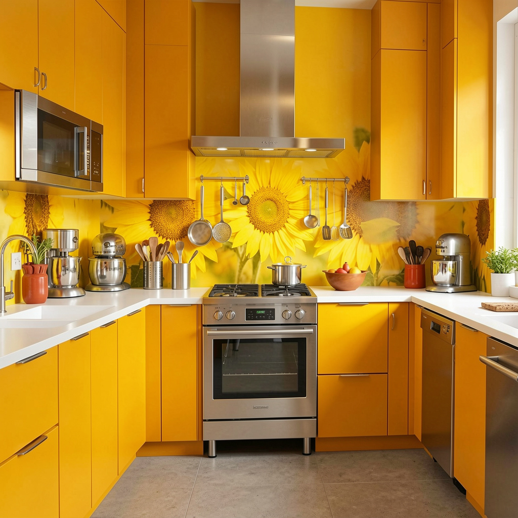
1. Chicago Kitchen Remodeling: Beyond the White Shaker Cabinet
If you look at typical Chicago kitchen remodeling projects from five years ago, they all look identical: white quartz, white cabinets, gray walls. It’s a fine look, but it lacks soul.
In 2026, the kitchen is where color drenching gets highly sophisticated. Instead of treating your cabinetry like a separate piece of furniture, we match the cabinet color exactly to the walls and trim.
The 2026 Palette: We’re seeing a massive shift toward earth-inspired tones. Think dusty emerald, rich matcha green, warm clay, and deep terracotta.
The Texture Play: To keep a drenched kitchen from looking flat, we play with different finishes. We might use a durable satin finish on the cabinetry to reflect light, a velvety matte on the walls, and a subtle limewash texture on the exhaust hood or accent columns.
The result? A kitchen that feels like an architectural masterpiece rather than a collection of mismatched puzzle pieces.
2. Chicago Bathroom Remodeling: Creating a True Mood Escape
The powder room or primary bath is the absolute perfect testing ground for color drenching. Because these spaces are naturally self-contained, you can commit to a mood without worrying about how it flows into the rest of the house.
When tackling a Chicago bathroom remodeling project, color drenching transforms the space from a basic utility room into a high-end sensory retreat.
The Enveloping Bath: Imagine walking into a bathroom coated entirely in a rich, warm mushroom or a deep plum. When the walls, ceiling, and vanity are completely tonally unified, the eye relaxes immediately because it doesn't have to jump between high-contrast boundaries.
Pairing with Slabs: This approach looks spectacular when paired with the bold, dramatic stone porcelain slabs that are trending right now. A saturated, dark-toned backdrop makes the natural veining of a quartzite or marble countertop absolutely sing.
3. The Rules of Engagement: How Not to Overdo It
Going bold requires a steady hand and a contractor who understands structural harmony. If you just throw dark paint on every surface without a plan, you risk making your home look like a cave. Here is how we ensure your Chicago home remodeling project stays elevated:
Use "Double Drenching" for Dimension
If a single color feels a bit too intense for your living room or open-concept space, we utilize a technique called double drenching. This involves using two closely related shades from the exact same color family. For example, you might choose a soft, sandy taupe for the walls, paired with a deeper, richer clay or mushroom tone for the trim and doors. You still get that seamless, low-contrast flow, but with an extra layer of architectural sophistication.
Let the Light Lead
Summer in Chicago brings gorgeous, shifting daylight off Lake Michigan, but our winters are a different story. Before we pick a drenched palette, we analyze the natural exposure of your windows. North-facing rooms handle cool tones poorly, turning gray-blues into icy shadows. Instead, we lean into colors with warm, grounding undertones—caramels, soft terracottas, and warm ochres—to make sure the room glows beautifully even on the gloomiest January afternoon.
Why Renovision Road Stands Out
At the end of the day, a successful color-drenched renovation comes down to execution. Painting trim, hidden electrical panels, registers, and doors to match a wall perfectly requires flawless craftsmanship and meticulous prep work.
Zero Fluff Philosophy: We don't push trends just because they are on social media. If a bold color doesn't fit the architectural DNA of your Lincoln Park brownstone or your Loop high-rise, we’ll tell you straight up and help you find a timeless alternative.
City-Proven Execution: From securing accurate material counts to scheduling around strict condo rules, we manage the gritty details so you can focus on watching your vision come to life.
Ready to say goodbye to the boring gray era? Contact Renovision Road today to schedule your consultation, and let’s plan a remodel that brings your Chicago home to life.
Frequently Asked Questions
-
Not in 2026. Buyers are actively seeking out homes that feel customized, intentional, and full of personality. The era of the "blank canvas flip" is losing traction to bespoke, high-end design details.
-
Absolutely. In fact, it’s highly recommended. Because color drenching eliminates the visual "lines" where walls meet the ceiling, it tricks the brain into seeing a continuous space, often making a tight layout feel grander and more cohesive.
-
Not at all. While deep burgundies and hunter greens look incredible, you can color drench using soft creams, chalky putties, or warm sages. The magic is in the unity of the application, not the darkness of the shade.
-
It's just paint! While changing a fully drenched room takes a little more primer than a standard wall, it is still one of the most cost-effective ways to completely alter the emotional landscape of your home.
-
Yes, absolutely. You do not have to jump straight into moody burgundies or deep forest greens to get the benefits of color drenching. You can execute this beautifully using ultra-sophisticated, low-saturation neutrals. Think warm chalky putties, soft alabaster creams, or muted oatmeals. By drenching a space in a soft, warm neutral—painting the walls, baseboards, and ceiling the exact same hue—you still get that high-end, seamless architectural look without feeling like you stepped inside a rainbow. It feels like a warm hug rather than a design shock.